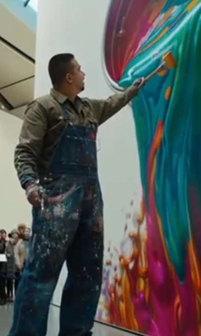
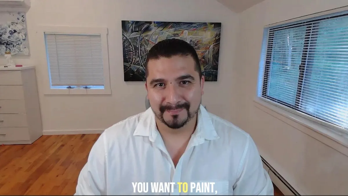
CLICK BELOW TO WATCH FIRST!
ART THAT EVOVELS
PIERO MANRIQUE
"I am Piero Manrique an artist and creator born in Lima Peru, inspired by the energy of landscapes, culture, technology, and spirit. My work blends tradition and technology, fusing art with the latest innovations in AI to transform spaces and touch souls."
OUR MISSION
Is to create art that inspired and transform environments. Through art, we evolve as technology evolves. We exist in a time where creativity can expand exponentially through Artificial Intelligence, where ideas flow instantly from imagination into reality. Art, design, and architecture are in constant motion, and our mission is to move with them, not behind them. We pursue innovation as a way of life, embracing new tools, new visions, and new ways of creating. We are here to collaborate with those who believe in growth, exploration, and the future of creative expression.
SERVICES
Our mission is to elevate your brand through exceptional design. We offer a comprehensive range of services tailored to meet your unique needs.
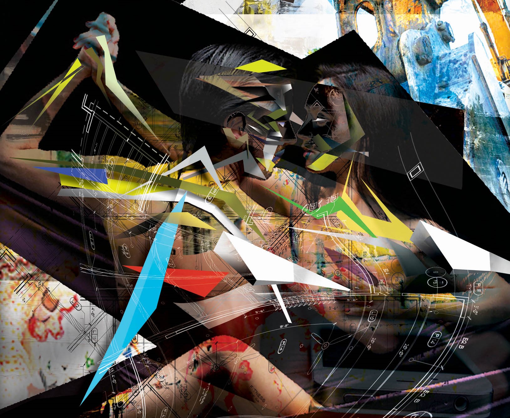
Commissioned Art
Custom-designed pieces tailored to your space and vision, created with passion and precision. Each artwork is crafted with intention, inspired by design, nature, movement, and emotion.
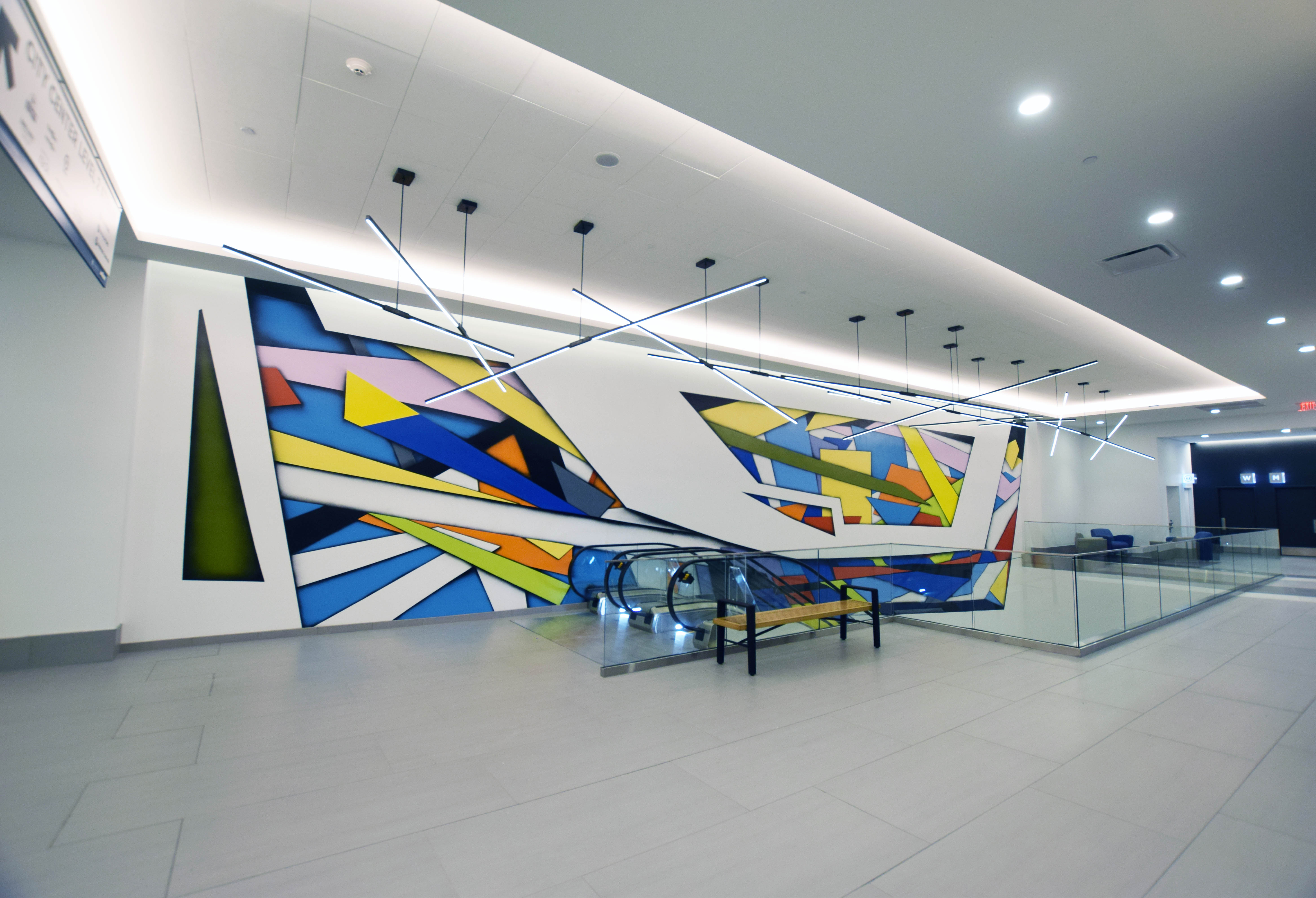
Murals
We provide mural design for interior and exterior environments. Every mural is customized to the site and the energy of each space.
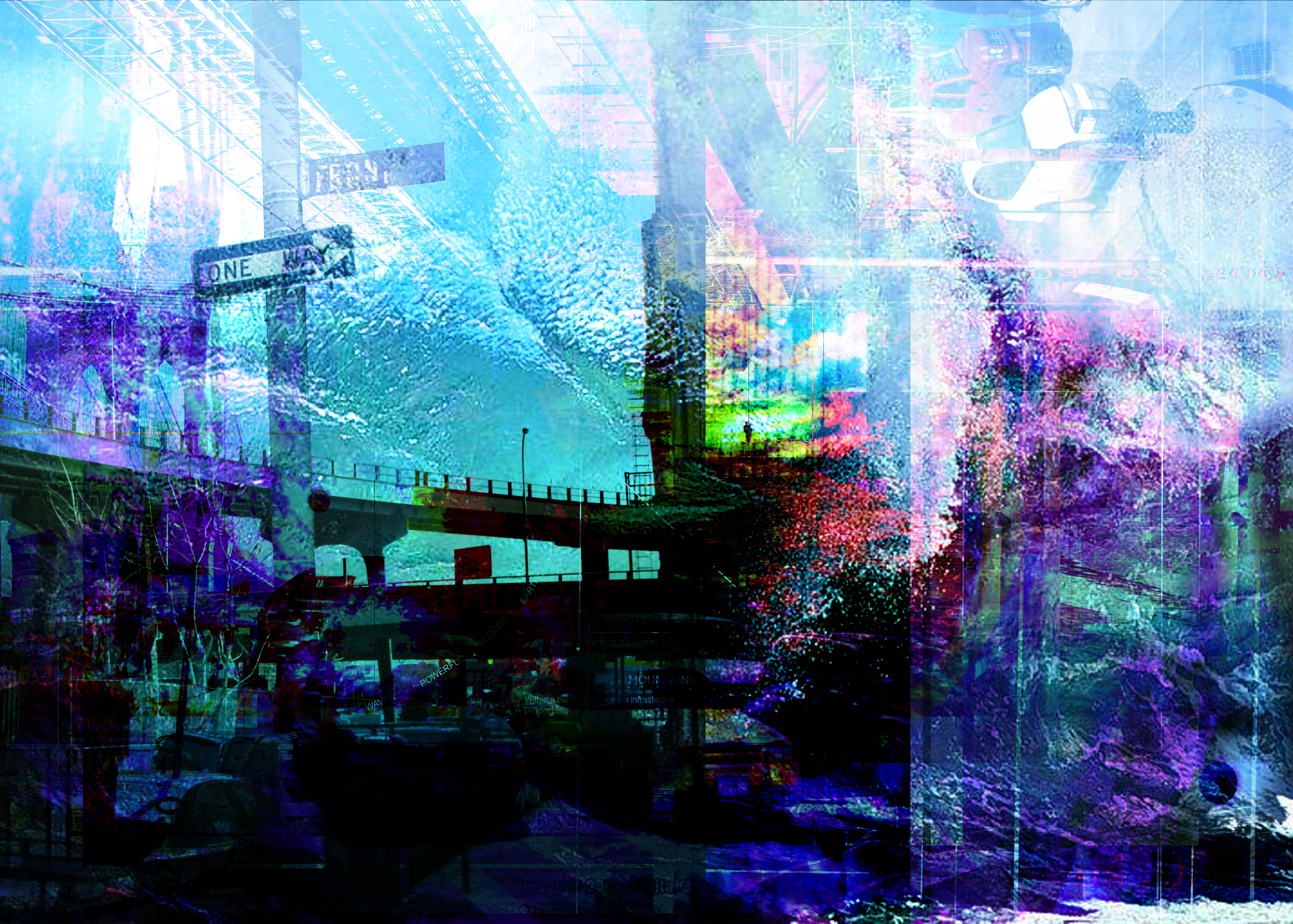
Graphical Art
Through advance digital design techniques and AI we provide original custom design enhasment to any digital image, for print and production work.
Art Teaching
Workshops and courses merging traditional techniques with cutting-edge AI empowering you to discover your creative potential
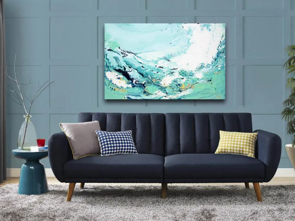
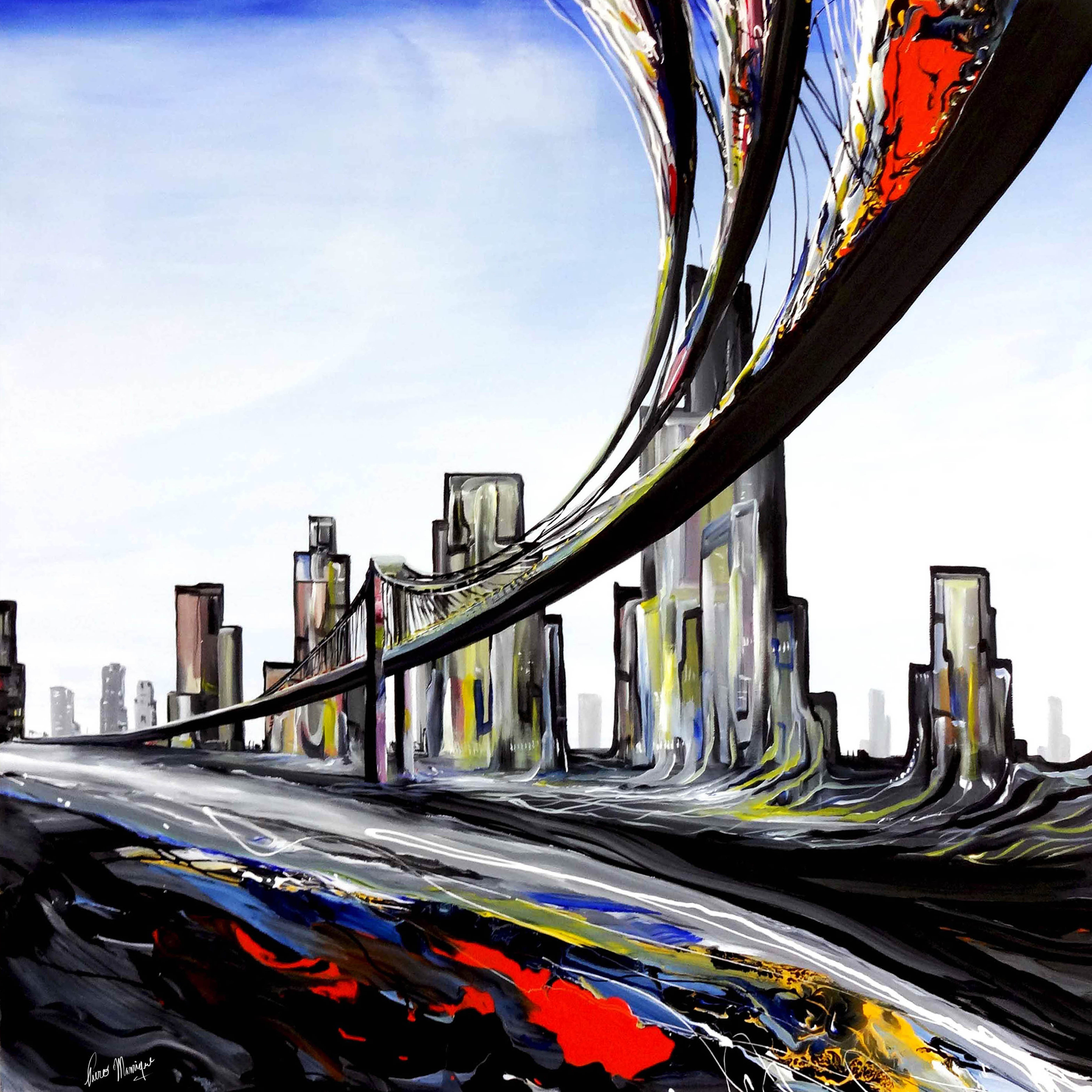
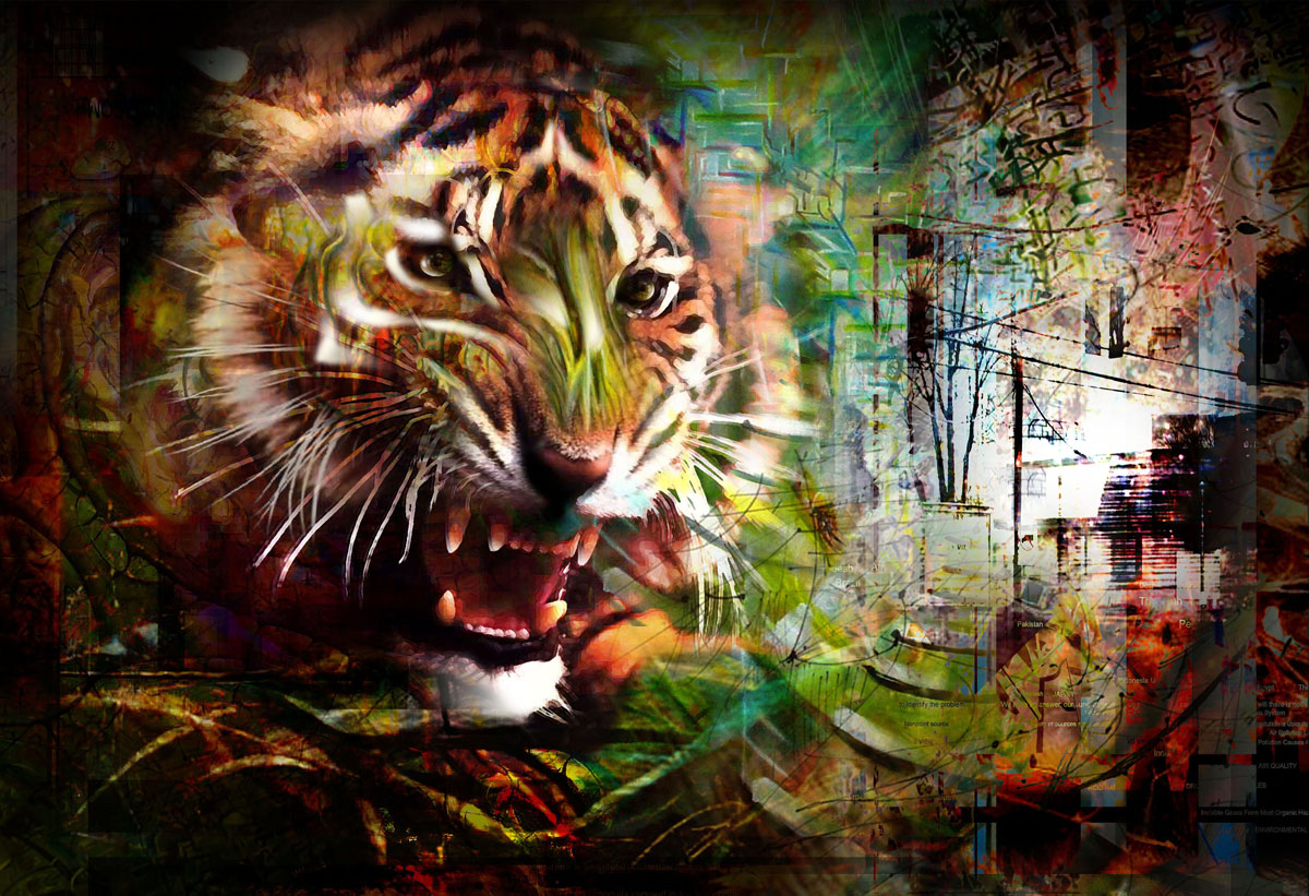
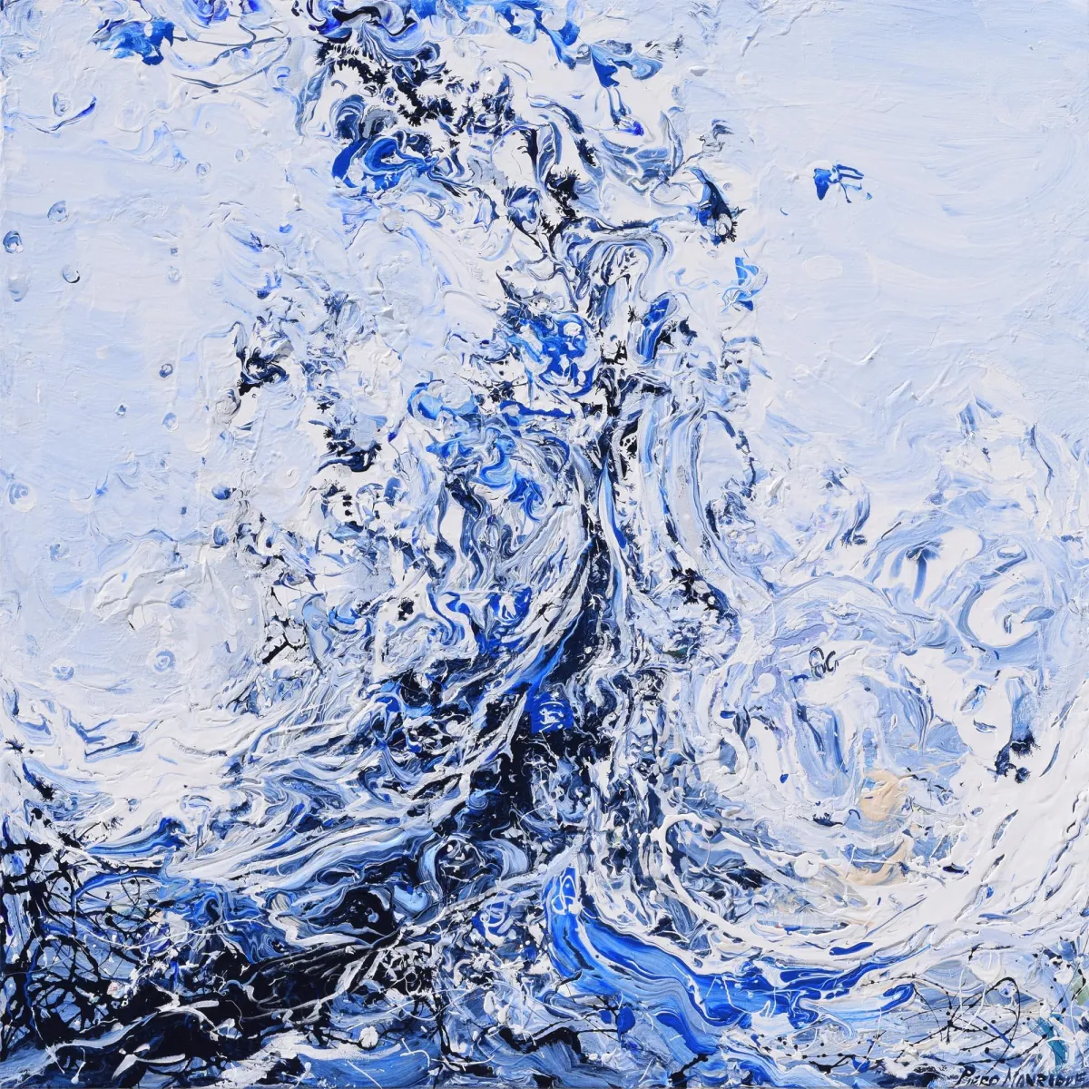
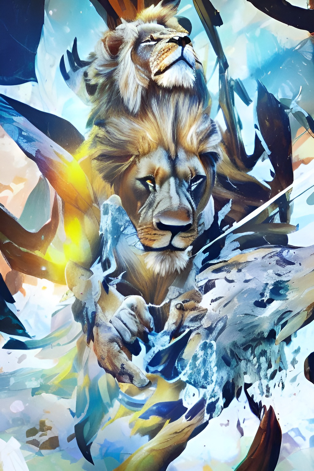
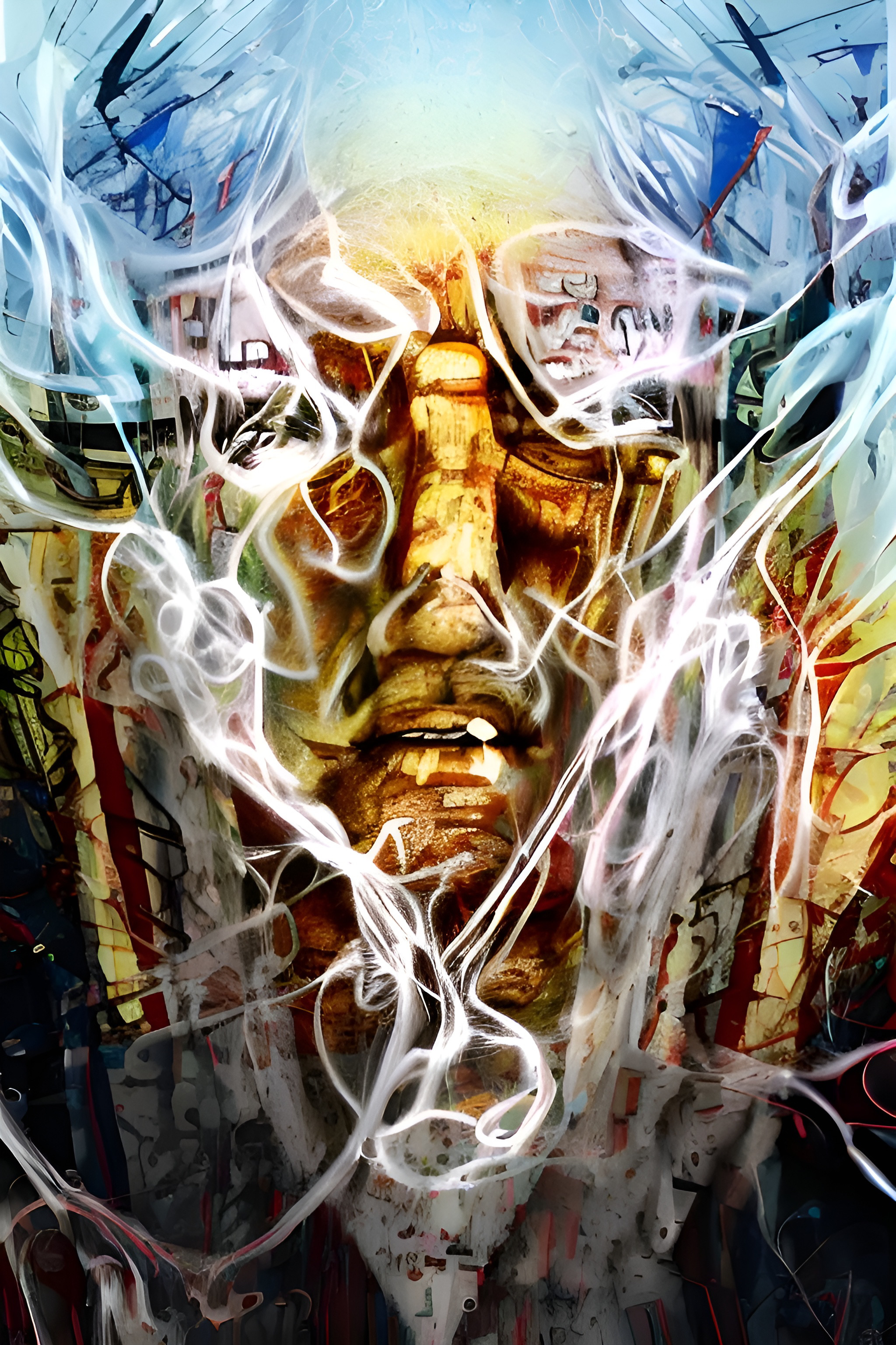
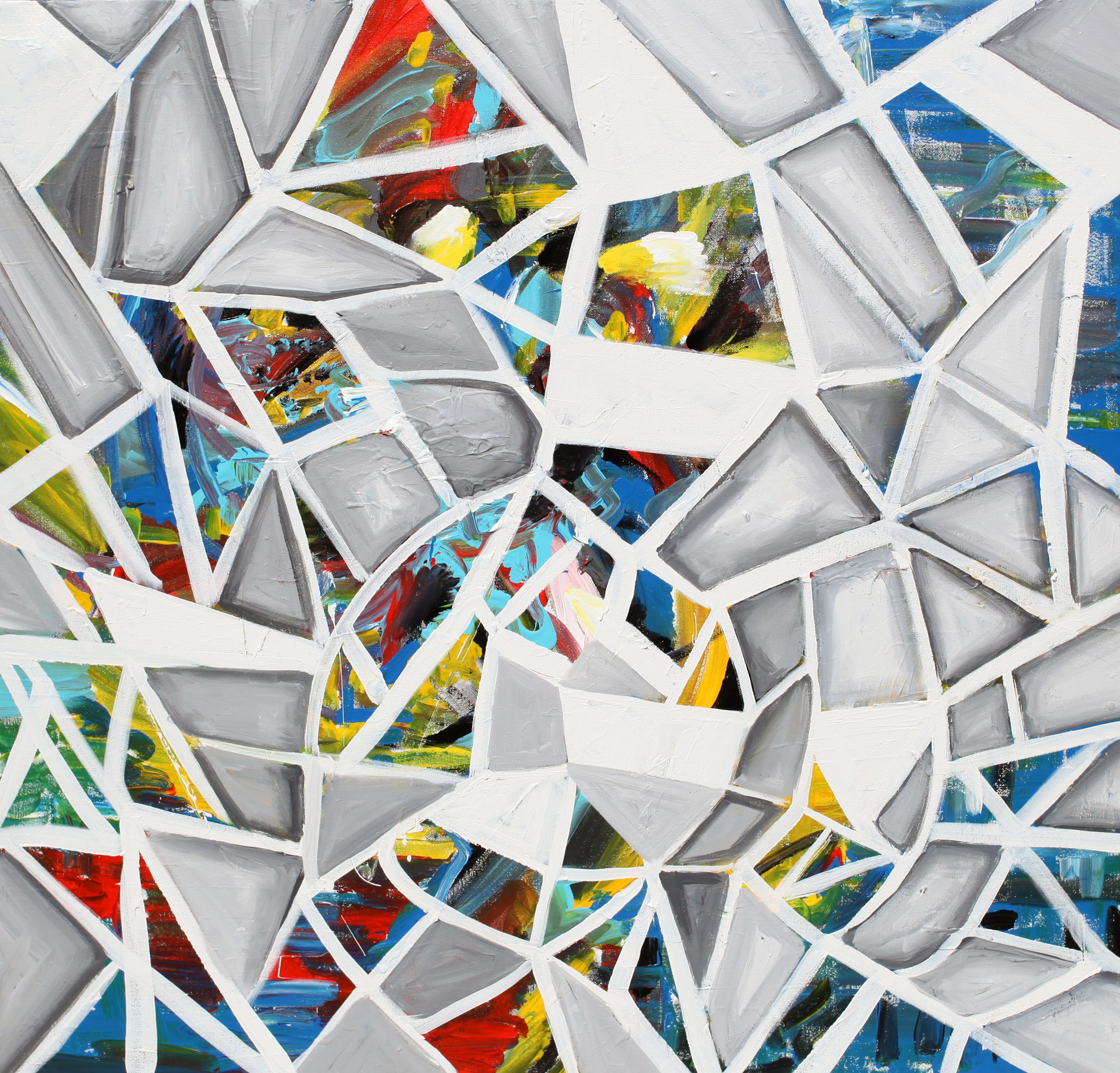
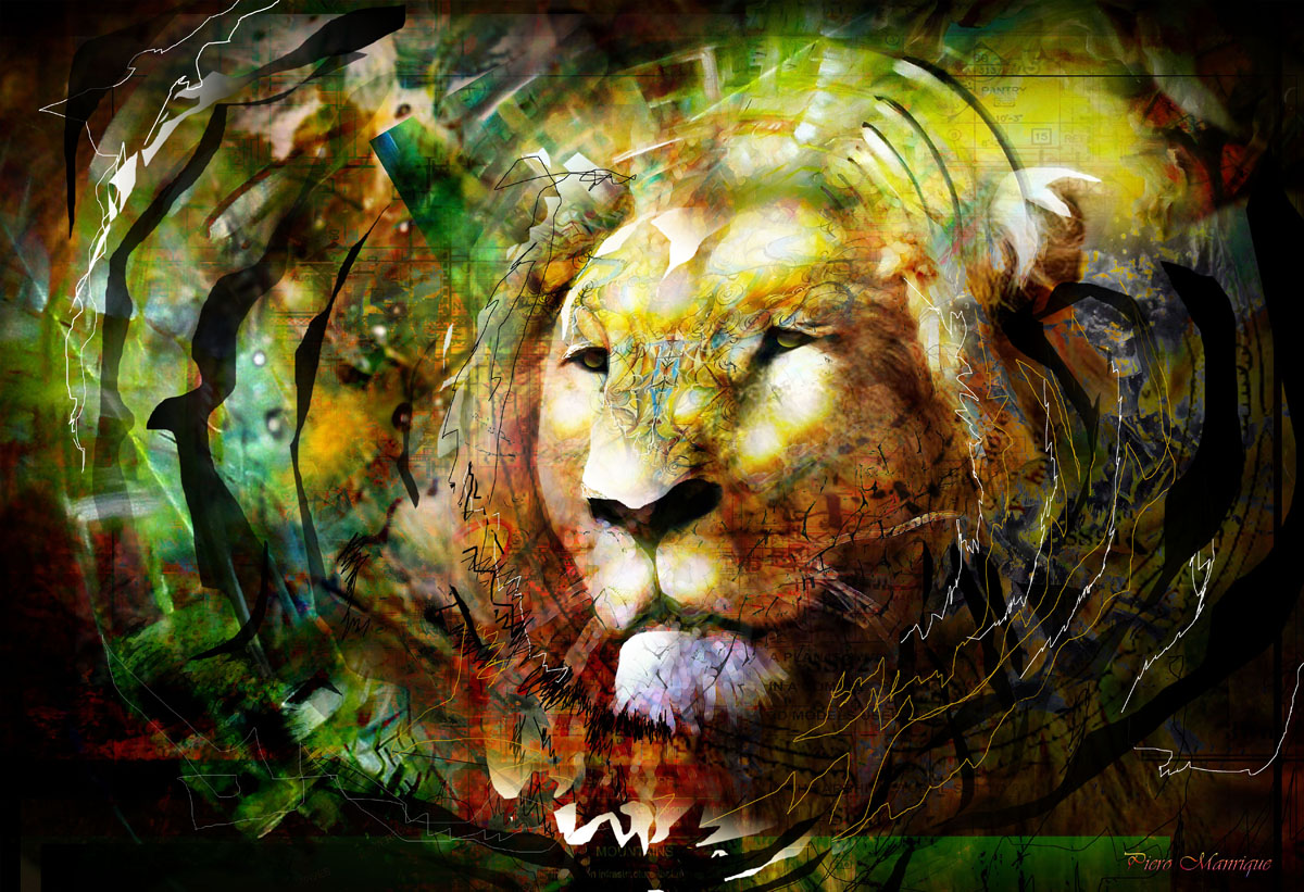
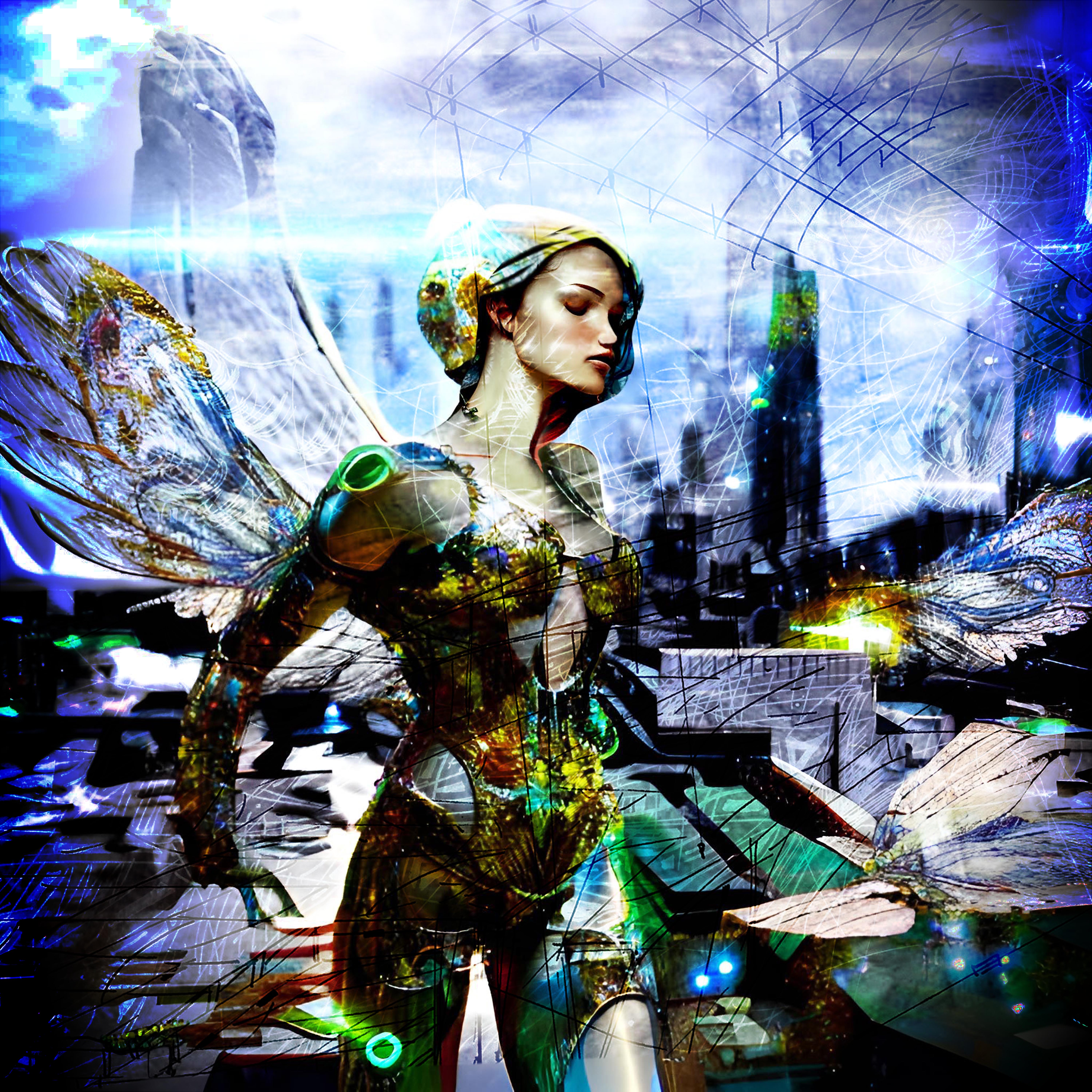
Art Showcase
PAINTINGS THAT INSPIRED
TESTIMONIALS
CLIENTS INCLUDE

Get In Touch